Jack Tivey · Geospatial analysis & spatial data production

Open to work

Portfolio

Jack Tivey Geospatial Portfolio

I make spatial data and then check it. Five projects here: a national dataset I built and corrected by hand, three pieces of university analysis, and a month in the Amazon collecting the kind of data the other four are made of.

Discipline
Geospatial analysis
Tools
QGIS, ArcGIS Pro, geojson.io, React, Claude Code
Degree
BSc (Hons) Physical Geography, 2024
Institution
UWE Bristol

01 · Spatial data production

Commercial · Since Jan 2026

Vestige Golf App: a national dataset of English golf course polygons

Base
Open mapping extract
Corrected in
QGIS, geojson.io
Features
1,773
Coverage
47 counties

Vestige is an iOS app for golfers who want a record of where they've actually played. Every course in England on one map, filling in as you work through them, with progress tracked by county and nationally.

The idea is simple. It just rests entirely on the map underneath it. A course is only as findable and as countable as its boundary is accurate, and there was no usable spatial dataset of English golf courses. So I built one.

Coverage starts as a bulk extract from open mapping data, which gets you most of the country and almost none of the accuracy. Boundaries drawn to no consistent rule, inconsistent tagging, courses missing, entries that closed or relocated years ago. The dataset is the correction pass, not the extract.

County by county, every polygon is checked against satellite imagery and redrawn in QGIS and geojson.io where it is wrong, to a single rule. Operational extent: playable ground plus clubhouse, car park and driving range where present. The legal freehold would have meant guessing, since it is not visible from imagery. Each county is then reconciled against independent listings to catch closures, relocations and duplicates.

That is 1,773 separate decisions about where a golf course stops, made one at a time, across 47 counties. I built the React admin tool that runs the review, partly so the work would be auditable and mostly so I would never have to do it in a spreadsheet. It loads a county, puts each imported feature next to its source tags, and takes keep, delete or merge. I built it with Claude Code, which is how a two-person project ends up with proper tooling instead of good intentions.

Whilst Vestige is my brainchild, it is a shared project. Tom writes the code for the iOS app and I expand and maintain its dataset. In-app features and decisions are always split, and through this we have created something we are very proud of.

Visit vestige.golf →

Vestige is a commercial project operated through Pinehollow Studios Limited, co-founded with Tom Slater.
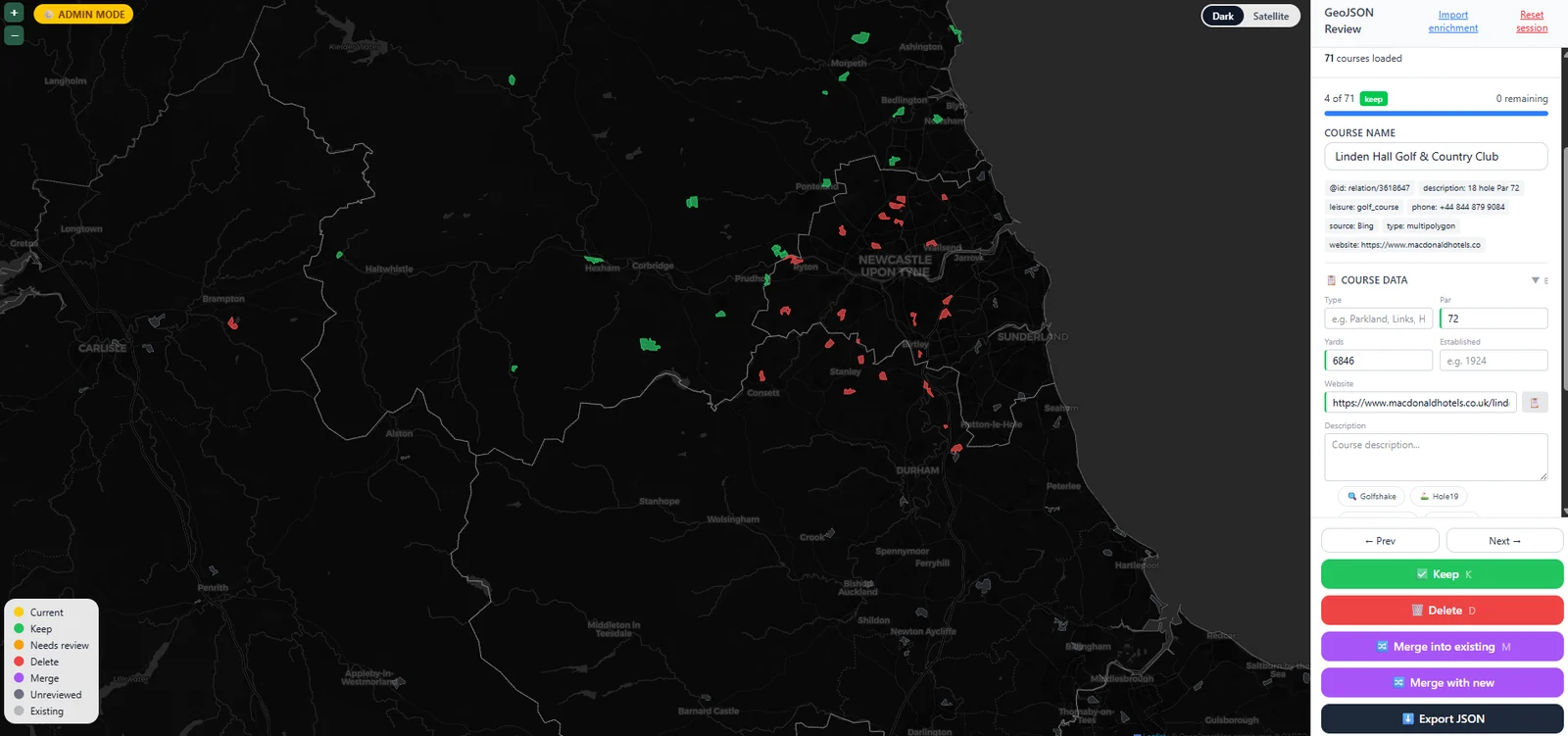
The Vestige admin review tool: a dark basemap of Tyne and Wear and County Durham covered with digitised golf course polygons colour-coded by review state, beside a panel showing the record for Linden Hall Golf and Country Club with its imported tags and keep, delete and merge actions.
Admin review workflow The React tool built to QA the dataset county by county. Each imported feature is reviewed against its source tags and resolved as keep, delete or merge, with progress tracked against the county total. Polygons are coloured by review state.

The dataset itself, at three scales

England · 1,773 courses

Drag to pan · double-click to zoom

The interactive map needs JavaScript. Every point is one reviewed course boundary. 1,773 of them across 47 English counties.
The same dataset at three scales England is drawn by the courses and the coastline alone. No tile service, nothing fetched from off this page. Zoom to Surrey to pick its 68 out of the surrounding counties, then to Hankley Common, where one exported aerial frame sits under the boundary so the rule can be checked rather than taken on trust: playable ground, clubhouse and car park inside, the heath to the east outside. Aerial imagery © Esri World Imagery.

02 · Land suitability modelling

Dissertation · 2024

National land suitability modelling for oilseed rape

Tool
ArcGIS Pro
Method
MCDA, AHP-weighted
Criteria
7 weighted, 1 constraint
Extent
UK-wide

The question was whether the UK could grow enough oilseed rape to fuel its own aviation. The short answer is no. The interesting part is by how much, and where the land that could is.

Seven criteria drawn from the agronomic literature (precipitation, mean air temperature, soil pH, growing degree days, sunshine hours, drought severity and distance to processing) were reclassified onto a common 1 to 10 suitability scale, weighted by pairwise comparison using the Analytic Hierarchy Process, and combined into a single national surface. Precipitation carried the heaviest weight at 30.5%, temperature 25.3% and soil pH 19.7%. Slope was handled separately as a binary constraint, excluding anything above 15%.

Clipped to land already farmed, the theoretically suitable area came down to roughly 6 million hectares, about half what full domestic demand would need. Which is a real answer, even if it is not the one the title was hoping for. Submitted as Assessing the UK's Agricultural Capability for Producing Sustainable Aviation Fuels (SAFs) from Oilseed Rape.

The method generalises. Narrowing a whole country to the land meeting a defined set of conditions is the same problem whatever the conditions are.

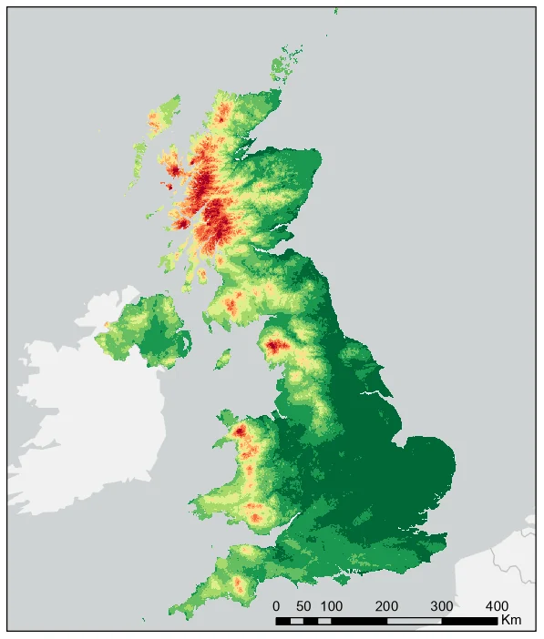
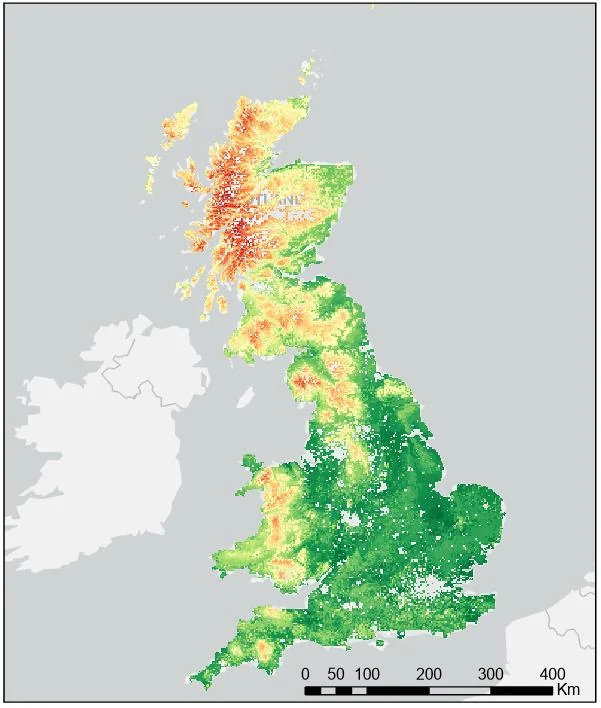
Suitability map of the United Kingdom for oilseed rape from the combined AHP-weighted model, before constraints. Most of England and eastern Scotland scores highly, with low suitability in the Scottish Highlands and upland Wales.
Combined MCDM surface, unconstrained Seven weighted criteria summed to a single national suitability score.
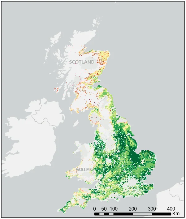
The same UK suitability surface clipped to slopes under 15% and to existing agricultural land, leaving a much reduced and fragmented suitable area concentrated in eastern England.
Clipped to slope and agricultural land The same surface constrained to slopes under 15% and existing farmland. Roughly 6 million hectares.
UK map showing mean annual precipitation reclassified to a 1 to 10 suitability scale for oilseed rape, with the driest eastern counties scoring highest.
One input criterion Mean annual precipitation, reclassified to the shared 1–10 suitability scale. Six further criteria were prepared the same way.
AHP criterion weights
Mean precipitation30.5%
Mean air temperature25.3%
Soil pH19.7%
Growing degree days10.7%
Sunshine hours7.6%
Drought severity index3.8%
Distance to production2.5%

Weights derived from pairwise comparison of all seven criteria. Consistency ratio 0.093, below Saaty's 0.10 threshold. Bars are scaled to the heaviest weight.

03 · Remote sensing

Three studies

Remote sensing and change detection

Studies
3
Methods
Change detection, NDVI, burn scar
Regions
Spain, Brazil, South Africa
Span
1984–2023

Three monitoring studies from my degree. Each one starts the same way: pick an environmental change that is obviously happening, then find a way to prove it from orbit rather than asserting it.

Baseline monitoring in method if not in subject. Establish the normal condition, then measure movement away from it.

Almería, Spain · 1984–2023

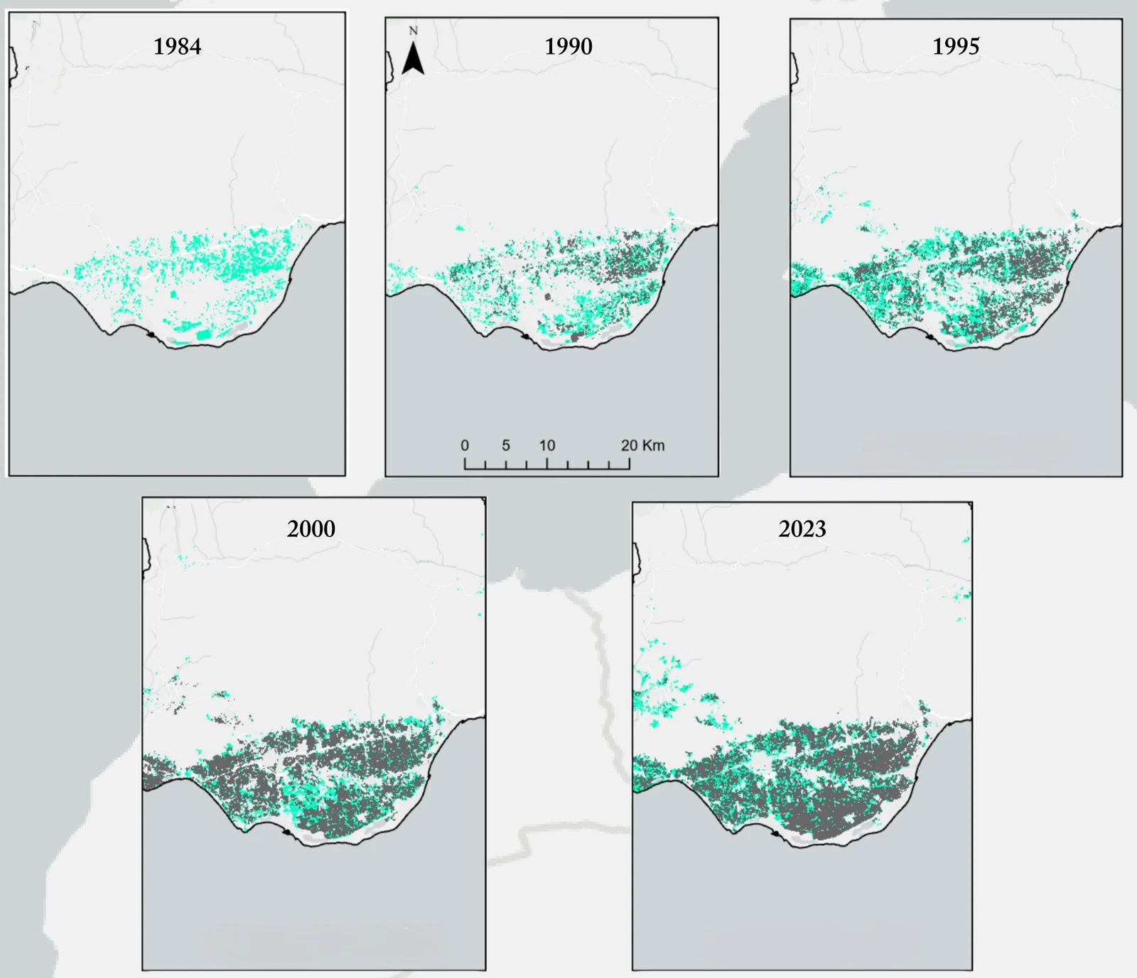
Almería is four decades of greenhouse expansion caught by landcover change detection, run on Landsat because nothing else reaches back to 1984.

Method
Landcover change detection
Sensor
Landsat
Epochs
1984, 1990, 1995, 2000, 2023
Five maps of the Almería coast for 1984, 1990, 1995, 2000 and 2023, showing greenhouse cover expanding from scattered patches to a near-continuous band along the coastal plain.
Almería, 1984–2023 Cyan marks new cover in each period, grey the cover already present. All five panels share a scale and orientation.

Porto Velho, Brazil · 2018–2023

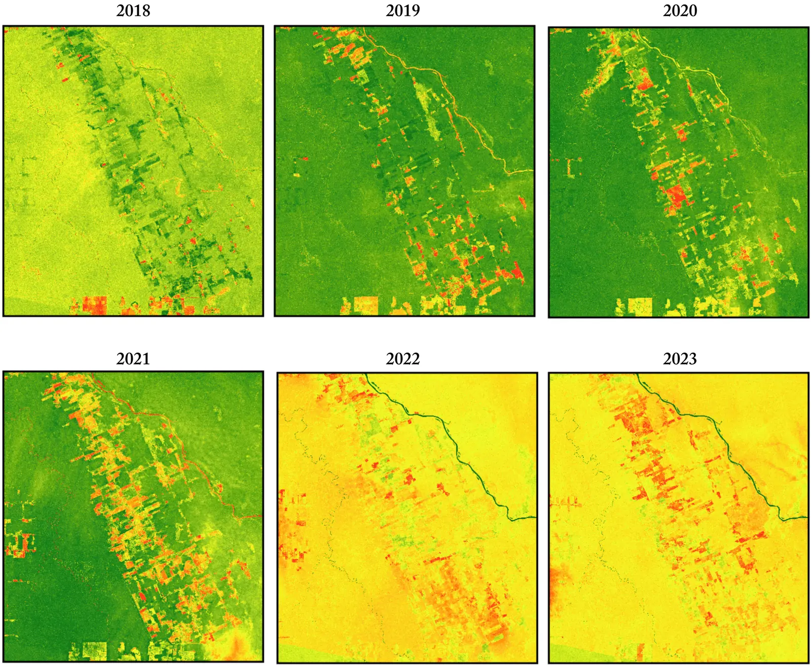
Porto Velho is an NDVI Z-score time series measuring vegetation anomaly against the period baseline, where the deforestation arrives as red fishbones spreading along access roads.

Method
NDVI Z-score anomaly
Baseline
Period mean, 2018–2023
Panels
6, one per year
Six NDVI Z-score panels around Porto Velho for 2018 to 2023, shifting from predominantly green to predominantly yellow, with red fishbone patterns spreading along access roads.
Porto Velho, 2018–2023 Green is healthier, more established vegetation. Red is low cover. All six panels share a scale and a north-up orientation.

uKhahlamba, South Africa · 2021

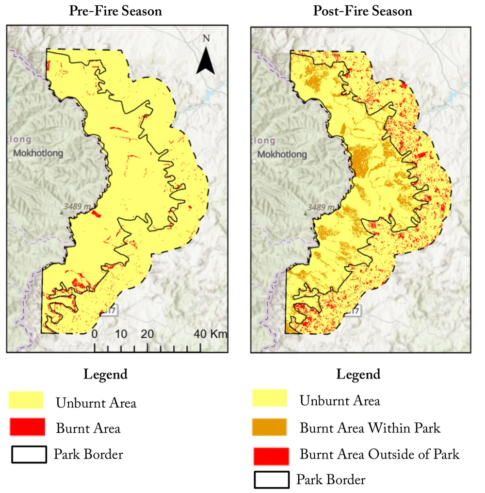
uKhahlamba is burn-scar mapping either side of the 2021 fire season, asking whether the managed firebreaks along the park boundary were actually holding. They were not, particularly.

Method
Burn-scar mapping
Season
2021, pre and post
Tests
Firebreak effectiveness
Paired burn-scar maps of the uKhahlamba World Heritage site for the 2021 pre-fire and post-fire seasons. The pre-fire map shows thin burn lines along the park boundary; the post-fire map shows extensive burning inside the park and scattered burning outside it.
uKhahlamba, 2021 Pre-fire season against post-fire season. Both panels share a scale and orientation.

04 · Hazard mapping

Sunda Strait

Tsunami vulnerability and hazard response

Method
MCDA vulnerability
Criteria
5
Scenarios
2 wave heights
Priority area
Bandar Lampung

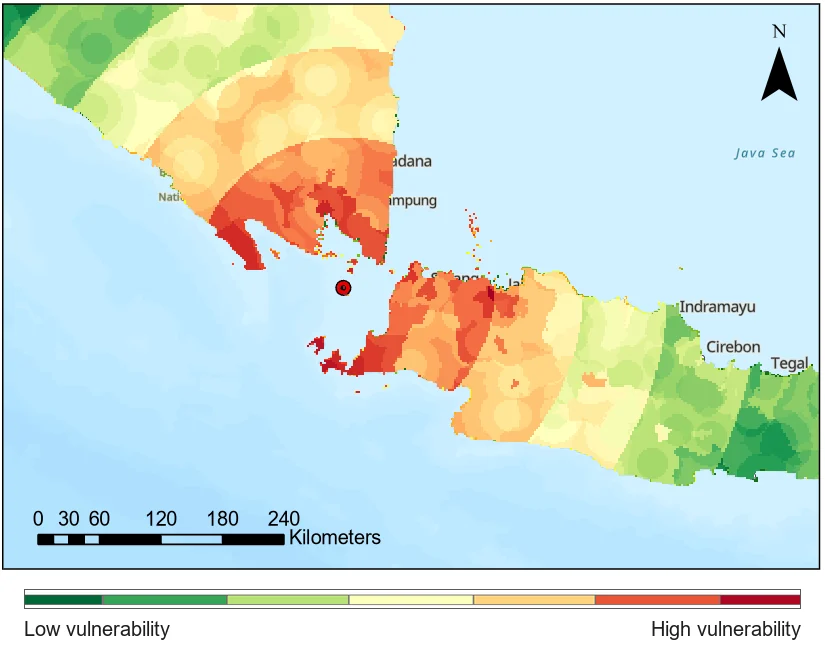
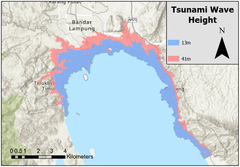
A hazard management plan for the Krakatoa region. Elevation, population density, age structure, purchasing power and distance to hospitals combined into a multi-criteria vulnerability surface, then inundation modelled against it for two eruption scenarios: 13m, which happened in 2018, and 41m, which happened in 1883.

The analysis put Bandar Lampung at the top: 75km north-east of the volcano, 1.16 million people, and a hospital distribution that assumes nobody needs to leave in a hurry. The plan costed the interventions against it. What that work actually taught me had nothing to do with the modelling. It was that a hazard map is read by someone under time pressure who did not ask for a legend with nine classes on it.

Turning spatial analysis into something a non-specialist can act on is most of the job.

Multi-criteria vulnerability surface across the Sunda Strait. Red, the most vulnerable class, covers the coast around Bandar Lampung and the western tip of Java near Krakatoa; green, the least vulnerable, covers the eastern coast towards Cirebon.
Vulnerability surface Elevation, population density, age structure, purchasing power and distance to hospitals combined into a single score. Krakatoa marked at centre.
Inundation map of Bandar Lampung bay showing modelled flood extent for two tsunami wave heights, 13 metres in blue and 41 metres in pink, reaching well inland around the head of the bay.
Modelled inundation, two scenarios Wave heights of 13m and 41m, taken from the 2018 Sunda Strait event and the 1883 eruption respectively.
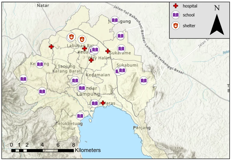
Map of Bandar Lampung showing current locations of hospitals, schools and shelters, with several schools and hospitals sited close to the coastline and shelters further inland.
Key infrastructure and land use planning Current siting of hospitals, schools and shelters against the modelled extent, and the basis for the plan's relocation and setback proposals.

05 · Field work

Peru · Feb 2025

A month at a research station in the Peruvian Amazon

Station
Kawsay
Location
Puerto Maldonado, Peru
Duration
One month
Focus
Spider monkey rehabilitation

Kawsay is a research station two hours downriver from Puerto Maldonado. I spent a month there as a volunteer, which in practice meant doing whatever the researchers needed doing: tagging tree species on ecological walks, carrying seeds and flowers back to camp to be identified, running trail cameras, counting whatever else moved. The camp ran on eight hours of electricity and six hours of WiFi a day. By the second week that starts to feel generous.

The station's long project is spider monkeys. They had been hunted out of the surrounding forest completely, to the point of local extinction. Years of rehabilitating confiscated animals and releasing them into the conservation area have put two distinct wild groups back into it. While I was there we introduced another individual, recovered from the black market, to one of those groups.

Porto Velho, in the remote sensing work above, sits 718km east of the station: the same deforestation frontier, one country over. I have now looked at that forest from both ends: as an NDVI anomaly measured against a six-year baseline, and as a tree I was standing next to with a tag in my hand.

By the time anyone analyses ecological baseline data it is a spreadsheet. It is worth knowing what it costs to collect.

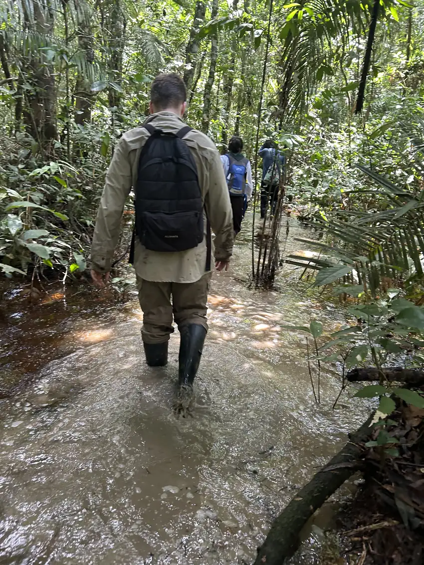
Wading a flooded forest trail at Kawsay in wellingtons and field kit, water above the knee, with another volunteer ahead under dense palm and understorey.
Getting to the plots Much of the survey work started with an hour of this. The trails flood, and the route to a transect is part of the transect.
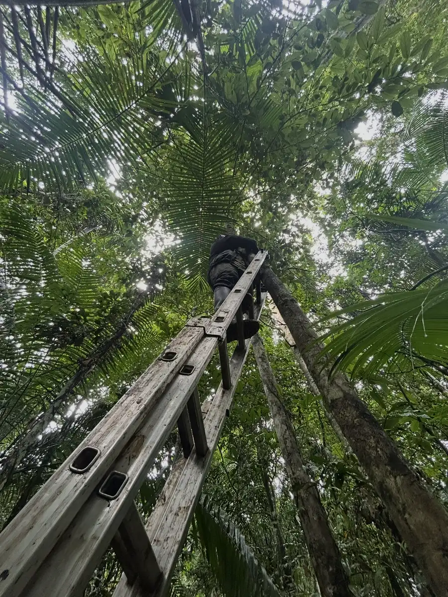
Looking straight up an extension ladder leaning against a rainforest tree, a researcher near the top, the canopy and sky fragmented by palm fronds above.
Tree tagging Not all of it happens at ground level.
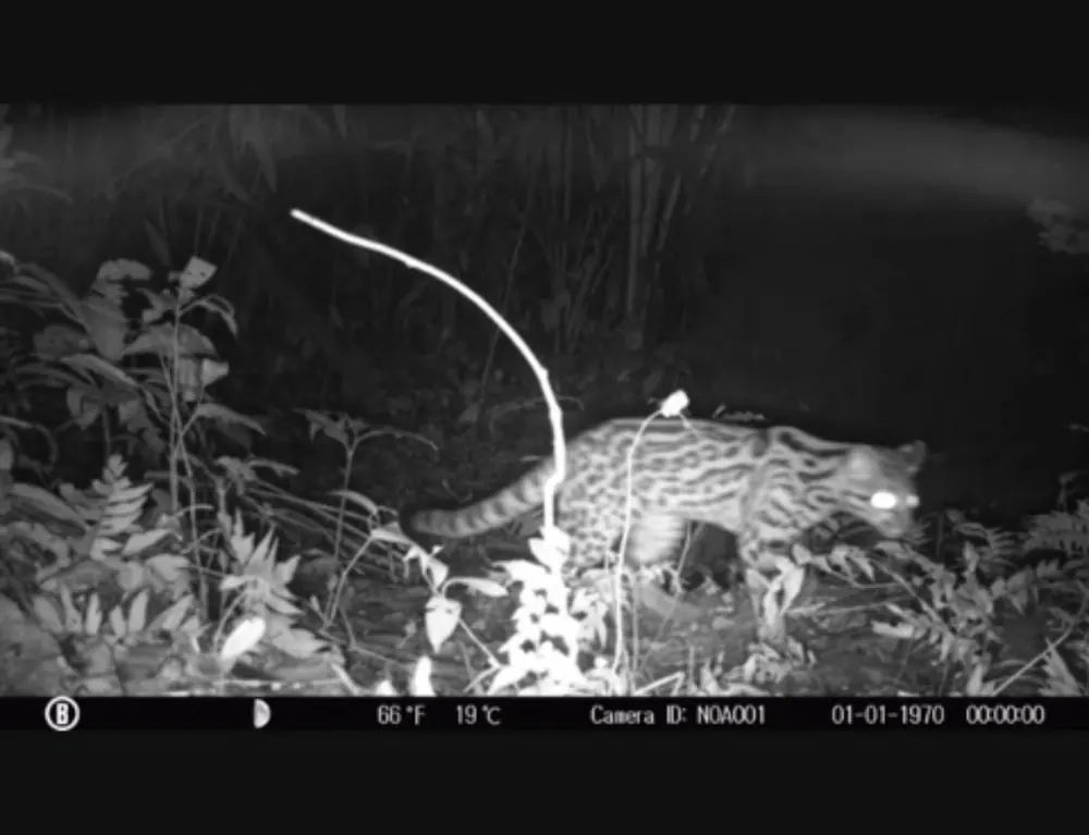
Infrared camera trap frame at night: an ocelot walking left to right through low vegetation, tail raised, eyes reflecting the flash. The status bar reads 19 degrees Celsius, Camera ID NOA001, 01-01-1970 00:00:00.
Camera NOA001 An ocelot, on one of the cameras we were running. They pay out slowly: you strap one to a tree, walk away, and weeks later find out what used the trail while nobody was there.
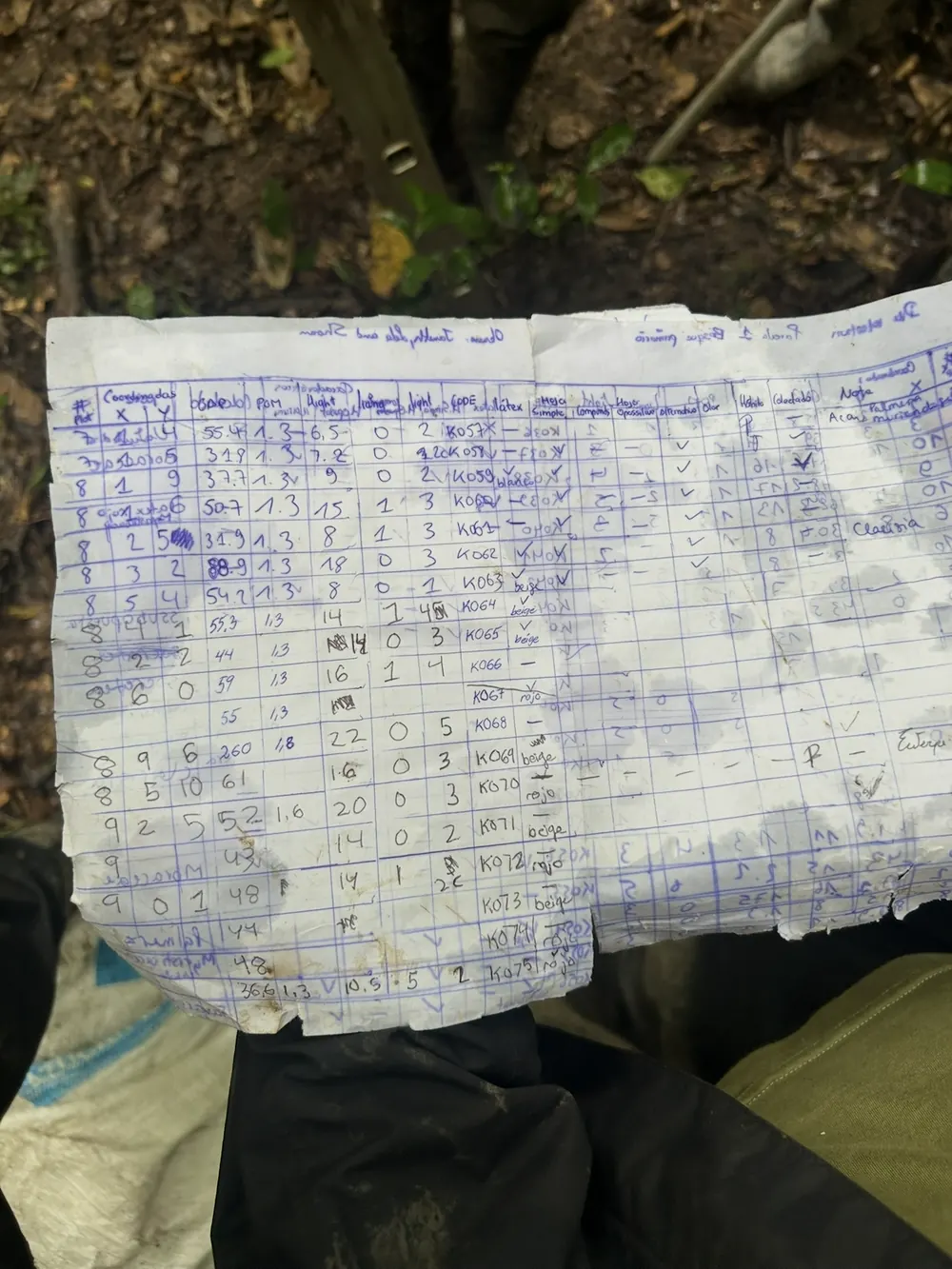
A hand-ruled field recording sheet held on a muddy knee, rain-soaked, torn across the lower right corner. Columns for plot, coordinates, point of measurement, height, latex, leaf type and habit; tree IDs K057 to K075 down the middle.
The results, after the rain Tree records K057 to K075. Coordinates, measurement height, leaf type, habit. Typed up later from whatever was still legible.